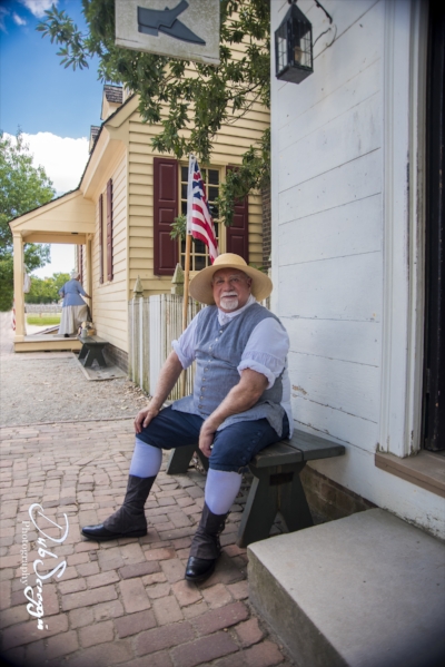
NOTE: All of the shots here were taken during a recent trip to Colonial Williamsburg, a great place to visit and a great place for black and white. The bus from the visitor center and crowded parking lot is like a time machine. You step in with a bunch of tourists and a few minutes later, you step out in Colonial days.
One of the nice things about digital cameras vs film cameras is that you don’t have to choose ahead of time whether you’re going to shoot black and white or color. If you wanted to shoot black and white with a film camera, it was a pre-meditated act. You got a roll of black and white T-Max, or Tri-X, stuck it in the camera and then shot only black and white until it was all shot up, which at 12, 24, or even 36 exposures per roll, wasn’t long. You also selected the ISO up front based on the film you were using and your expected conditions, 200, 400, or even 800, if you could risk the noise and grain.
In the digital age, though, you can change ISO on the fly, frame by frame, and you don’t have to make the black and white vs. color decision until you’re sitting at your computer in Photoshop.
There are some shots that just look better in black and white. Getting rid of the distractions of color focuses the viewer’s attention on form and texture, and if that is where you want the viewer’s attention focused, then black and white is a good choice.
In this shot, for example, I really liked the lines of the roofs, the chimneys and the repeating shapes. That is what I want the viewer to focus on, not the colors of the bricks and sky, so I converted it to black and white.
In this shot, my focus was on the lines of the steps, railings, and bricks and I liked the gritty texture. Black and white highlights those things.
Here my focus was on the lines of the fence and repeating shapes of the posts and well in the background, but I also liked the texture of the worn wood, perfect for black and white.
There are also shots that don’t have a lot of color in them to start with. If the frame is going to be mostly monochrome anyway, why not make it black and white?
Color was not really a factor in this shot, so converting to black and white makes sense. And it captures the texture much better.
And even though the old days were pretty much the same colors as the modern days, there are no color pictures from those days, so we often think of those days in black and white. Therefore, sometimes a shot works best in black and white if you want to evoke the feel of those old times.
I really liked this shot, where I captured a fellow in period costume, along with the lady in similar dress in the background, but I wanted to further evoke the old-time feel, so I swapped to black and white. I think the vignette also helps with that feel.
A couple more examples, where black and white works well to transport the viewer back in time.
Of course, maintaining that illusion of old times, means eliminating things from the picture that contradict that illusion. In Williamsburg, the biggest thing to worry about getting rid of is tourists. They're everywhere. Sometimes you can eliminate them by lucking out and finding a shot with none of them in it and sometimes you just have to get rid of those who are in it using Photoshop.
With the wider view of the horse and carriage shot above, there were several tourists who had to be removed in Photoshop. In more narrowly focused shots, they can be removed by just waiting for a lull in the flow or cropping your view to not include any.
One of the nicest things about Colonial Williamsburg is that there are no cars, power lines or utility boxes to worry about. Nothing spoils the illusion of stepping into the past quite like a Hyundai parked at the curb or a massive tangle of power lines overhead.


