Evolution of an Image

Back in the olden days when film ruled the world of photography, you basically got what you shot. It was possible to make post-shot changes in the darkroom but only limited changes were possible. Cropping, dodging, burning, and exposure were about the only things one could change. Imagine if masters like Ansel Adams had digital cameras, computers, and the capabilities of Lightroom and Photoshop with which to play. They took darkroom editing to its limits, but that capability pales in comparison to the post-processing and editing we can do today. Which brings me to my purpose with this blog, the evolution of an image from what I originally shot to what I finally ended up with.

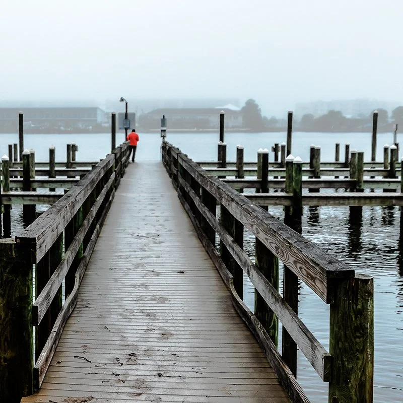
This is the original image, shot on a dreary, foggy, winter morning in Florida. It was taken with my Nikon D810 at f4, 1/200 sec, ISO-200 with a 28-105mm zoom lens set at 28mm. My original intent was to capture the entire dock, which I did. I noticed the solitary person standing out there, but he was small, blended into the gray and not my subject.

As I was looking at the image, I decided I would prefer a tighter crop to accentuate the lines at the center and the person standing there. At the same time, I adjusted the crop to move that person to the upper left intersection of the “rule of thirds” lines, putting him a third over and a third down from the top left corner. I also needed to straighten the horizon. The image changed to this.

I liked that a lot better. The subject was now the person, not the whole dock, and the lines served to highlight that subject. I decided I needed to do more there, though, so I used an overlaid layer to change his coat to red and then used the transparency slider to adjust the intensity of the red..

I liked the red coat much better. It brought the focus more onto the guy standing out there. I wasn’t completely happy with the crop though. I didn’t like the concrete in the foreground or all the white space at the top and felt neither contributed to the image. I needed to crop at the top and bottom, but I didn’t want to lose the lines at the sides. So I made a second crop but went with a square format, trimming top and bottom but not the sides. With the square format, I was also still able to keep the subject at the “thirds” intersection.

But then I thought as long as everything in the image is monochrome except the red coat, I might as well convert the whole image to black and white to enhance the texture of the shot. So I did. Then I used the history brush to erase the black and white conversion from the coat. This is the final image.

There are hundreds of things I could have done to this image becauseI have the post-processing tools to do so. Basically, this means there are minimal limits on my creativity. Thanks to the digital age of photography, I can visualize what I want the image to look like and then make it happen. Of course, it is important to do as much to capture my vision as possible with a clean, in-focus, correctly exposed and composed image in-camera, but I have the option to make an image stronger and, in some cases, even rescue an image I might otherwise just delete. For example, this shot was also taken on a foggy Florida morning.

I very nearly deleted it as having no redeeming qualities. But then I decided I still liked the footprints in the sand that led me to take the image in the first place, and that maybe there was something I could do in Photoshop to rescue the shot. I ended up with this, which I like a lot.

One Picture - Four Moods

I took this picture the other day at the beach in Navarre while I was scouting a location for a model shoot. I liked the lines and the shadows and took this shot with the intent of making it a black and white in order to highlight those effects.

DUB_3287cls.jpg

But when I got to playing with it in black and white I had trouble deciding how I wanted it to look. I tried a Low Key approach.

DUB_3287cls-bw-lowkey.jpg

But it was too dark, so I tried a High Key approach.

DUB_3287cls-bw-hikey.jpg

And I liked it, but it was a bit too bright. I tried a softer effect with a tint and a white vignette.

DUB_3287cls-bw-vig.jpg

But I wasn't all that wild about that one, so I tried an Infrared effect.

DUB_3287cls-bw-ir.jpg

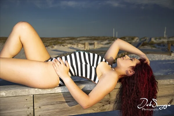
And I liked how that turned out, but now I don’t know which I like better, although I’m leaning toward the IR. Or maybe the High Key. Or I could go with something else entirely. All in all, I think that railing looks best with a model on it. Thanks to Kayla Winters.

Kayla.jpg

Playing With Shadows

Playing With Shadows

NOTE: Most of these shots were captured at the Boardwalk on Okaloosa Island, Fort Walton Beach, Florida. Thanks to Amber Smith and Olga Boistean for modeling for the other two.

Some say photography is all about light. It is also all about shadows. I wanted a picture of the pattern of shadows made by this railing, and I picked this spot because the one missing shadow in the pattern added interest.

Some say photography is all about light. It is also all about shadows. I wanted a picture of the pattern of shadows made by this railing, and I picked this spot because the one missing shadow in the pattern added interest.

Some say the best time of day for shooting pictures is early morning or late afternoon, because of the softness of the light, meaning the shadows are not so harsh. They are right.

Some say the best time of day for shooting pictures is early morning or late afternoon, because of the softness of the light, meaning the shadows are not so harsh. They are right.

It is also because of the length and drama of the shadows, though.

It is also because of the length and drama of the shadows, though.


Shadows can definitely add drama to a scene. Which is more dramatic? This?

DUB_0642sml.jpg


Or this?

DUB_0641sml.jpg
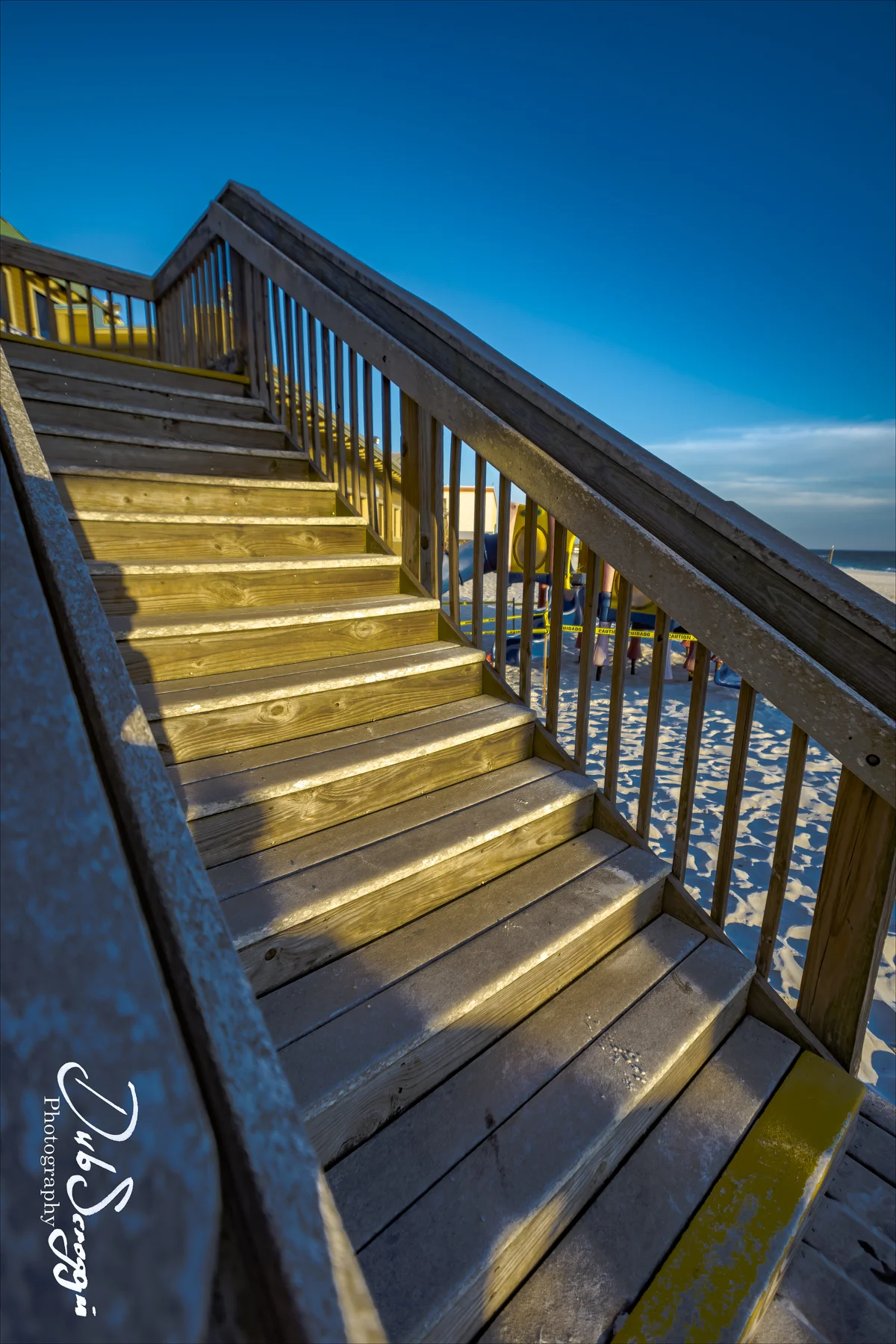
Shadows can be used to highlight architectural features. These stairs are more interesting with the shadows cast by the setting sun.

Shadows can be used to highlight architectural features. These stairs are more interesting with the shadows cast by the setting sun.

Some architectural features are nicer than others, of course.

Some architectural features are nicer than others, of course.

Shadows can add depth. Here, the shadows from the railing add depth to the image, and the shadows from the footprints in the sand add texture.

Shadows can add depth. Here, the shadows from the railing add depth to the image, and the shadows from the footprints in the sand add texture.

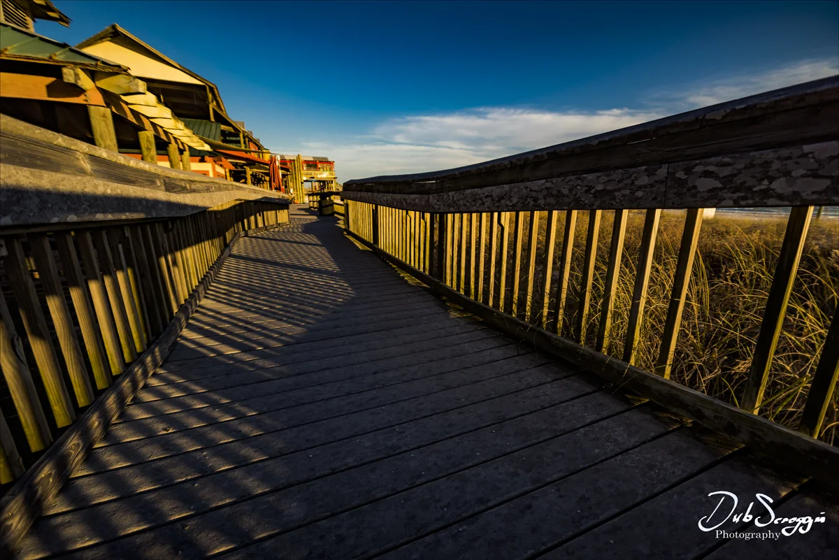
And shadows can add interest by emphasizing the lines and perspective of an image. Here both the shadows cast by the railing, and the shadows on the back side of the railing itself add to the image. The interplay between the lines and the shadows on…

And shadows can add interest by emphasizing the lines and perspective of an image. Here both the shadows cast by the railing, and the shadows on the back side of the railing itself add to the image. The interplay between the lines and the shadows on the deck is what attracted me to this scene.

Shadows can add texture. For example, the side lighting here produces deep shadows that highlight the texture of the boards. The hardest thing about this shot was managing not to be in either the reflections from the windows, or the shadows on the f…

Shadows can add texture. For example, the side lighting here produces deep shadows that highlight the texture of the boards. The hardest thing about this shot was managing not to be in either the reflections from the windows, or the shadows on the floor. I hid behind a pillar and reached the camera around it for the shot.

And shadows can be used to highlight highlights. For example, on this shot I wanted to highlight the highlights of the setting sun shining on the sea oats, so I deepened the shadows in Photoshop to make those highlights stand out more.

And shadows can be used to highlight highlights. For example, on this shot I wanted to highlight the highlights of the setting sun shining on the sea oats, so I deepened the shadows in Photoshop to make those highlights stand out more.

Bottom Line: Shadows can enhance photography in many ways, and while it is often good to soften them, especially in portrait, glamour or real estate photography, they should not be completely eliminated. In fact, sometimes, they are the subject of the image. The shadow knows...

Black and White vs. Color

NOTE: All of the shots here were taken during a recent trip to Colonial Williamsburg, a great place to visit and a great place for black and white. The bus from the visitor center and crowded parking lot is like a time machine. You step in with a bunch of tourists and a few minutes later, you step out in Colonial days.

DUB_7669bwsml.jpg


One of the nice things about digital cameras vs film cameras is that you don’t have to choose ahead of time whether you’re going to shoot black and white or color. If you wanted to shoot black and white with a film camera, it was a pre-meditated act. You got a roll of black and white T-Max, or Tri-X, stuck it in the camera and then shot only black and white until it was all shot up, which at 12, 24, or even 36 exposures per roll, wasn’t long. You also selected the ISO up front based on the film you were using and your expected conditions, 200, 400, or even 800, if you could risk the noise and grain.

In the digital age, though, you can change ISO on the fly, frame by frame, and you don’t have to make the black and white vs. color decision until you’re sitting at your computer in Photoshop.

There are some shots that just look better in black and white. Getting rid of the distractions of color focuses the viewer’s attention on form and texture, and if that is where you want the viewer’s attention focused, then black and white is a good choice.

DUB_7619sml.jpg


In this shot, for example, I really liked the lines of the roofs, the chimneys and the repeating shapes. That is what I want the viewer to focus on, not the colors of the bricks and sky, so I converted it to black and white.

DUB_7619bwsml.jpg
DUB_7675bwsml.jpg

In this shot, my focus was on the lines of the steps, railings, and bricks and I liked the gritty texture. Black and white highlights those things.

DUB_7683bwsml.jpg

Here my focus was on the lines of the fence and repeating shapes of the posts and well in the background, but I also liked the texture of the worn wood, perfect for black and white.

There are also shots that don’t have a lot of color in them to start with. If the frame is going to be mostly monochrome anyway, why not make it black and white?

DUB_7631sml.jpg

Color was not really a factor in this shot, so converting to black and white makes sense. And it captures the texture much better.

DUB_7631bwsml.jpg


And even though the old days were pretty much the same colors as the modern days, there are no color pictures from those days, so we often think of those days in black and white. Therefore, sometimes a shot works best in black and white if you want to evoke the feel of those old times.

DUB_7657sml.jpg

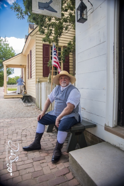
I really liked this shot, where I captured a fellow in period costume, along with the lady in similar dress in the background, but I wanted to further evoke the old-time feel, so I swapped to black and white. I think the vignette also helps with that feel.

DUB_7657bwsml.jpg


A couple more examples, where black and white works well to transport the viewer back in time.

DUB_7649bwsml.jpg
DUB_7682bwsml.jpg

Of course, maintaining that illusion of old times, means eliminating things from the picture that contradict that illusion. In Williamsburg, the biggest thing to worry about getting rid of is tourists. They're everywhere. Sometimes you can eliminate them by lucking out and finding a shot with none of them in it and sometimes you just have to get rid of those who are in it using Photoshop.

DUB_7659bwsml.jpg

With the wider view of the horse and carriage shot above, there were several tourists who had to be removed in Photoshop. In more narrowly focused shots, they can be removed by just waiting for a lull in the flow or cropping your view to not include any.


One of the nicest things about Colonial Williamsburg is that there are no cars, power lines or utility boxes to worry about. Nothing spoils the illusion of stepping into the past quite like a Hyundai parked at the curb or a massive tangle of power lines overhead.


Playing With Off-Camera Light

Playing With Off-Camera Light

Light is fascinating stuff and capturing it is the essence of photography. Good light can enhance the beauty of a subject, while bad light can make anyone look bad. It is the skilled and well-equipped photographer who can manipulate light to serve his or her needs.

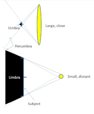
So what is good light, and what is bad? Small light sources cause harsh shadows (large dark areas or umbras, as illustrated below), while larger light sources offer softer shadows (less umbra and more penumbra). A large light source that is far away becomes a small light source. Large = good, small = bad.


Here are some examples, starting with bad lighting situations.

For years, a rule of thumb in taking snapshots of people has been to put the sun behind you. The sun is a pretty bright thing, which makes people squint when they look toward it, making it hard to see their eyes.


Of course, you can always have them wear sunglasses, but then you don’t see their eyes at all.

And because it is so far away, the sun is also a small light source, resulting in harsh shadows. For that reason, it is better to shoot people on cloudy days rather than sunny days. Clouds are much larger light sources and provide more even light. It is also better to shoot either early or late in the day, when the sun is at a lower angle. It’s a softer, warmer, more flattering light.

What if we turn the subject around and shoot toward the sun? The subject will no longer be squinting, but the bright light behind her will tend to silhouette her. 

It is possible to add a little fill flash or a reflector to soften those shadows and be able to see her better, which can make for an interesting portrait. 

The ideal for natural light, though, would be to use it as a primary light and use a reflector or an off-camera flash as a secondary light to fill in the shadows. This adds depth and interest. 

The quality of light from an off-camera flash can be controlled with modifiers. A bare bulb provides a pretty harsh and unflattering light, whether from the front, the side or the back. Why? It’s a small light source compared to the subject.


The lighting from behind, called rim lighting, has some interesting effects, if we can add a secondary light source to bring back the details. 

A large, diffuse, off-camera flash source, such as an umbrella or softbox, placed fairly close to the subject results in a large light source and provides a soft, even light that works well.

NOTE: Many thanks to Amber Smith for the lighting assistance and modeling for these shots.

Lighting Challenge - Inside Out

Lighting Challenge – Shooting Bright Exteriors from Dim Interiors


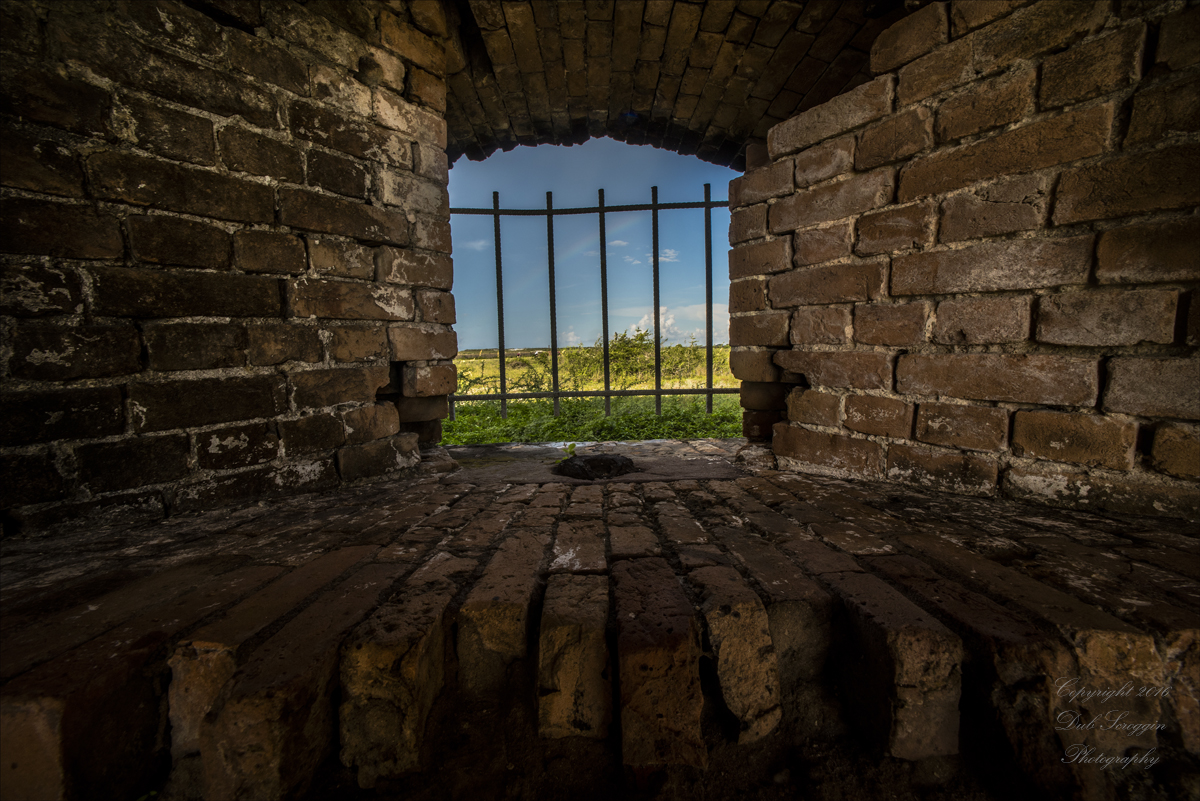
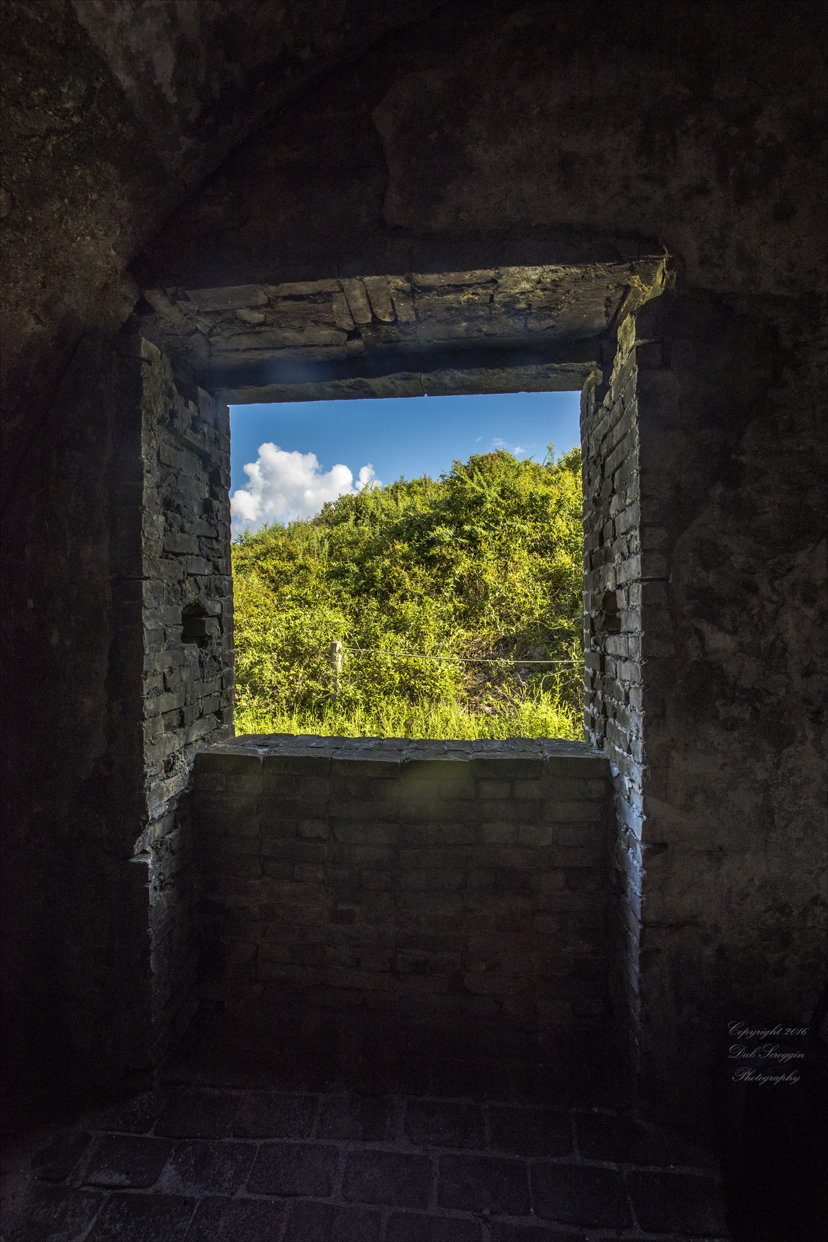
               One of my favorite places to shoot on Florida’s Emerald Coast is Fort Pickens on Santa Rosa Island near Pensacola Beach. A relic from the Civil War, the place is a treasure trove of angles and arches and rustic brick, a great place for photographers.

               However, it is pretty dark inside the fort and being Florida, a state generally known for its tourist-baking sunshine, it’s pretty bright outside. If you expose for outside, the inside is black…


And if you expose for inside, the outside is stark white…


               On my most recent trip to the Fort, I challenged myself to get shots of outside from inside while maintaining detail in both. I have done this in the past by taking two exposures and combining them using layers.


But the challenge I gave myself this time was to do both in one image. I figured the solution was to average the exposures between the outside and the inside, overexposing the outside while underexposing the inside, and then hope the RAW file would have the latitude to go in both directions from there, lowering the highlights while bumping up the shadows.

This is straight out of the camera (overexposed outside and underexposed inside):

And this is after correcting both exposures in Adobe Camera Raw:

Another example:


Dealing With Background Distractions

Dealing With Background Distractions Using Photoshop


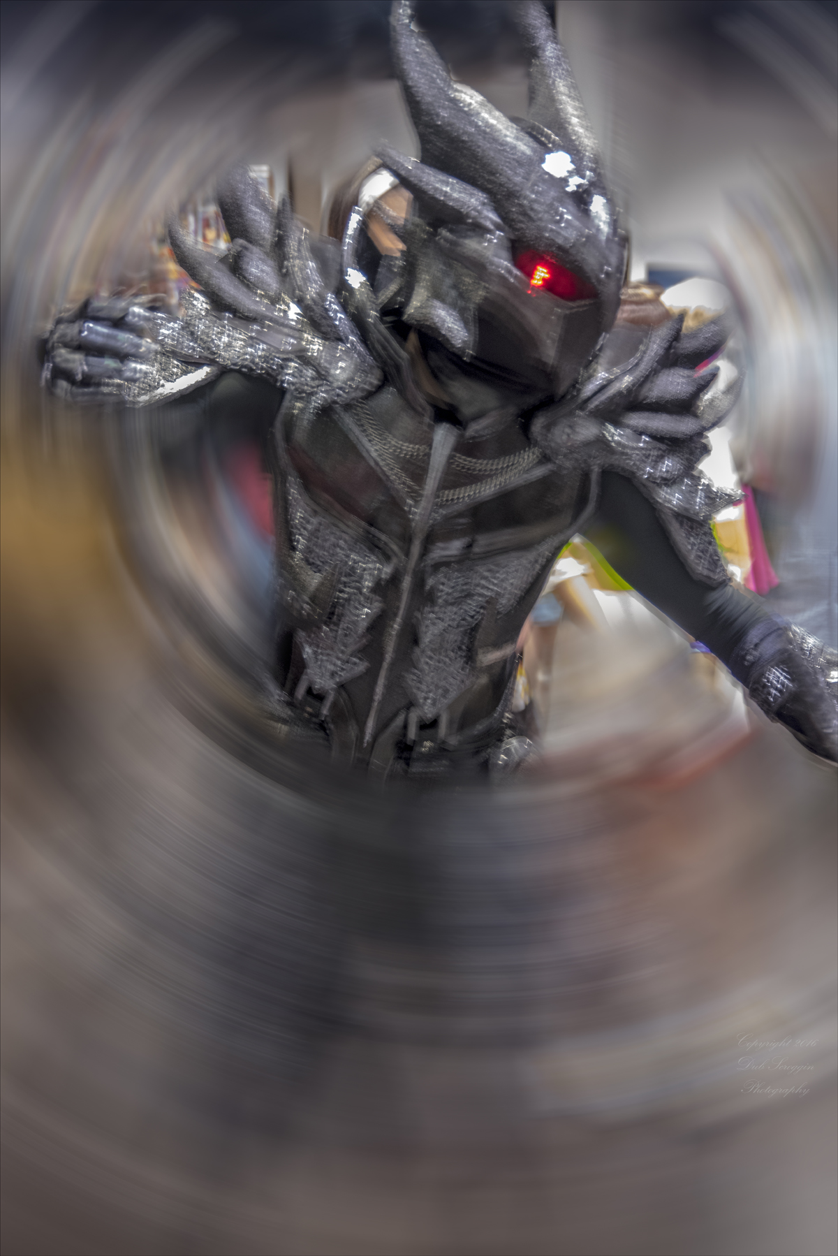
I had the privilege recently of attending Comic-Con in Tampa, Florida. I’m glad I brought along my camera because some of the costumes the other attendees wore were amazing in their depth and detail. The setting, however, was not conducive to good photography. There was a huge, teeming crowd of people, both the less bold normal folks and the magnificently costumed folks. Plus there was a myriad assortment of colorful displays and graphic artwork. As a result, it was difficult to isolate the subjects from the cluttered background.


I tried isolating them using depth-of-field by going with a large aperture, but there was still far too much distracting, colorful clutter. I tried slower exposures, so the moving people would be blurred, while the stationary subjects wouldn’t be, but the subjects weren’t all that stationary either. I think they were distracted by all the distractions. I tried isolating them using a flash, but there was nothing to bounce the light off of, because the ceiling was very dark and very high. This resulted in pretty harsh light.

I finally decided to just take the shots I could get and worry about the backgrounds during post-processing in Photoshop. After doing what I could to optimize the light in Adobe Camera Raw, I pulled the images into Photoshop and began playing with them. I liked some of the things I was able to do using various tools under Filter>Blur, and then employing the History brush to selectively erase the effects, so I concentrated my efforts there. It was surprisingly easy.

In the example above, I used a combination of the Gaussian Blur filter and then the Radial Blur (spin).


The result looked like this:


Obviously, the background is no longer an issue, but the foreground is pretty well obliterated, too.  I then used the history brush. This entailed going to the History window, clicking the box to the left of the step before the first blur action,


then going to the image and pressing the “Y” key to bring up the brush. I then used the brush to erase the blur effects from the entire figure. This took awhile, but it was fun to see the figure slowly emerge from the blur.


The same process was used in the images below, the only difference being in the blur tools used.

In this one I used just the Gaussian Blur, but applied it twice

In this one I used just the Gaussian Blur, but applied it twice

In this one I used the Motion Blur

In this one I used the Motion Blur

I overexposed this to try to blow out some of the background, but I didn’t realize at the time that the shot was also blurred by the subject’s movement. I liked the shot, though, and just decided I needed to use his motion. I used a combination…

I overexposed this to try to blow out some of the background, but I didn’t realize at the time that the shot was also blurred by the subject’s movement. I liked the shot, though, and just decided I needed to use his motion. I used a combination of Gaussian Blur and Radial Blur to create a swirl and then erased a circle in it to make it look like he was peeking out of another dimension, or maybe tearing his way through a little tornado.”

I loved this butterfly’s smile and decided that I wanted to not only get rid of the background distractions, but to highlight that beautiful smile. I used a combination of the Gaussian Blur and the Radial Blur (zoom), and then erased just the effect…

I loved this butterfly’s smile and decided that I wanted to not only get rid of the background distractions, but to highlight that beautiful smile. I used a combination of the Gaussian Blur and the Radial Blur (zoom), and then erased just the effects on her face.


Video Editing in Adobe Photoshop CC

Video Editing in Adobe Photoshop CC

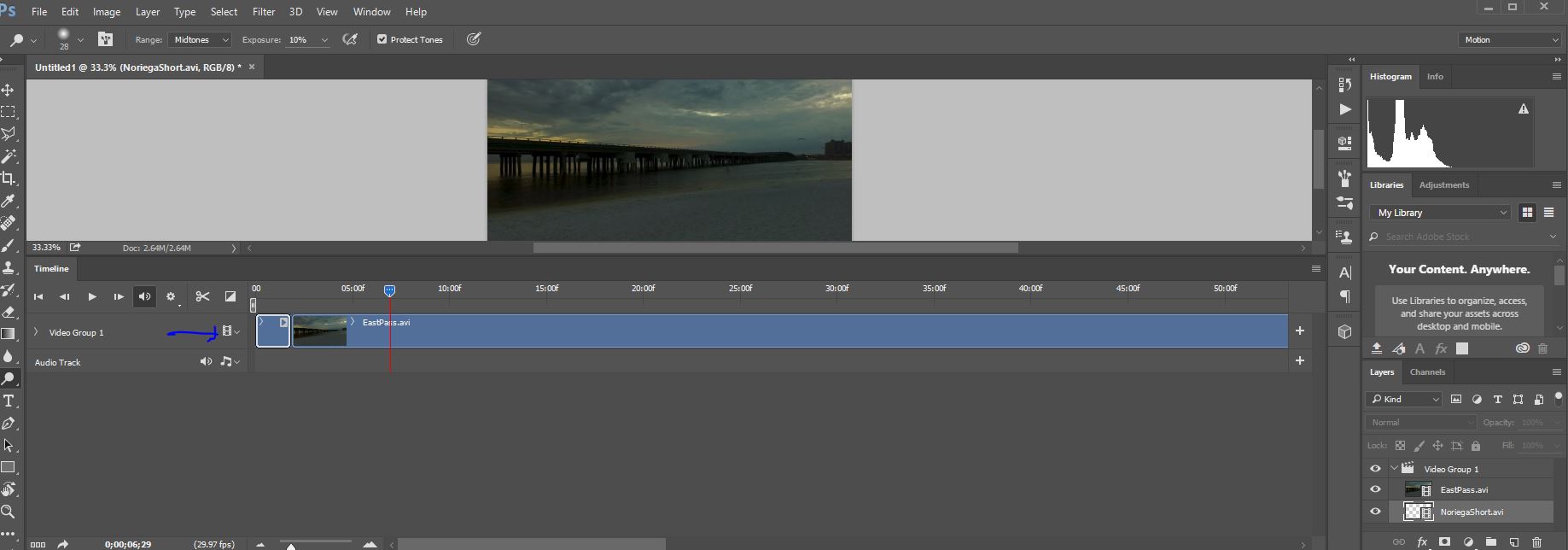
I have been working with Adobe Photoshop since CS4 and am always amazed at how much it will do. There are hidden little gems of capability lurking everywhere in the program, and occasionally I will get to know another one and then incorporate into my editing arsenal. This one, though, is a huge capability that I never knew existed in the program. It can do video editing—and not just the basic stuff. It can fade video in and out, fade pictures into the video where and when you want them, add type where and when you want it, as well as add audio and make it all flow seamlessly. It’s all done using the existing layers capability where each track is another layer. The editor looks like this:

For an example of what can be done, see this drone/beach shoot video I posted on YouTube. I learned a lot about video editing making this video:

The video editing workspace is cleverly hidden and is accessed by going to the workspace button at the top right corner of the screen and clicking on the word Motion (the blue arrow in the picture above).

This brings up the layers palette on the right, the viewing area in the middle, and the video stream editing panel on the bottom. All the magic will take place at the bottom of the screen.

First, though, you have to gather whatever video files you want to edit. Most of my video files are taken with a drone. Stick what you want to work with in a separate folder and then go to File>Scripts>Load files into stack. That brings up a window allowing you to browse to your folder and select the two or more files you want to load. You can add other files later if you want, but I find it best to get it all together at the start.

Hit OK and the files are loaded into separate layers.

This may take a while depending on how big the files are. Once it’s loaded it will look like this:

Your video files are loaded as layers in the layer palette on the right, as stacked lines in the video editing panel on the bottom, and a picture shows up in the viewing area.

Next to each video clip in the editing panel is a little film strip with an arrow by it. Make sure all the layers are selected, then hit that top film strip thing and select New video group from clips. This will incorporate your clips into one video group running sequentially, instead of consecutively. It’ll look something like this:


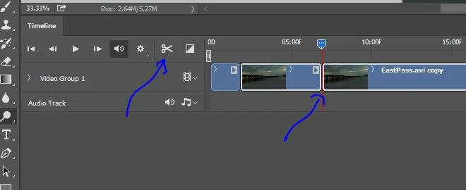
The clips are now sequential under a new video group. On the bottom editing panel, there is a little blue pentagon with dots in it. Dragging that to the right will pan through your video clips. It’s a very important tool. Over on the left are controls that can move it. Press the little play arrow and the blue pentagon moves across the screen while your video plays in the viewing window like magic. Press the stop button and it stops. Press the little |> or <| buttons and you can step from frame to frame, handy for pinpointing where you want the video to be. There is also a little scissors button. Hit that and you snip the clip into two clips at the point where the blue pentagon is located, like so:


Using this set of tools, you can snip out portions of the clips you want to discard. Select the clip to be discarded and it will be highlighted in the layers palette. Drag it to the trashcan and it’s gone, just like any other layer. One of the nice things about digital is you don’t have to wade through the piles of discarded film on the cutting room floor, and no tape is needed to put the film back together after your snip. If you want to move clips around, select them and then use the mouse to drag them to where you want them.

There is also a little transition button for fading in and out with five options to choose from.


This allows you to do pretty cool stuff, like fading in from black, or fading out to white. You can also control the length of the fade. A “cross fade” will do both a fade-out on one clip and a fade-in on the next.


That little inclined plane at the front of a clip is your fade-in. If it is on the back of a clip, it's a fade-out. You can also select it and extend or shorten it. Pretty cool stuff.

Remember to save your work from time to time. This is done just like with any Photoshop file by using the File>Save As button. Your work will be saved as a PSD file. When you’re done, you want to “render” your video. This is done under the little box on the top right of the editing panel.


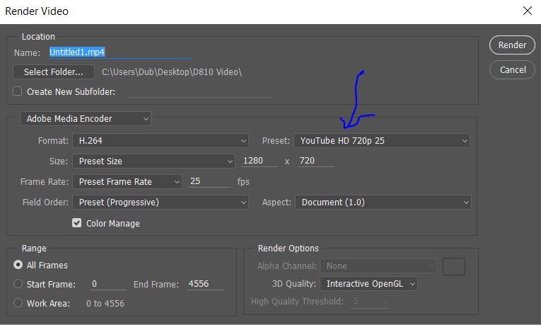
Which brings up this screen:


You can put in your title, select where to save and there are a whole mess of presets you can use for how you want it formatted. These are located under the Preset: arrow. I selected YouTube HD 720p 25. Once you have it all how you want it, hit Render and the computer will go to work creating your video.

Next time, I’ll go into detail on adding things like titles, audio, inserting still shots, fading them in and out, and the use of layer transparency to do some pretty fun stuff. Enjoy.


Mile Marker 13

It was late March and we set out on a venture heading north from Tucson. We drove through a blizzard to reach Flagstaff and considered turning around, but the interstate was closed behind us due to icy conditions. We pressed on and outran the storm to Monument Valley, where we spent the night in The View hotel, a great hotel that absolutely lives up to its name. The storm caught up to us overnight, and we woke to a bitingly-cold, snow-covered sunrise over the Mittens and Merrick Butte. This was taken from our balcony.


Then we headed up Highway 163 en route to Moab and Arches National Park. Along the way, I had to pull over at Mile Marker 13 and get this picture.


A long-haired and heavily-bearded fellow stops running and the dozens of disciples running behind him also stop in breathless anticipation of him saying something momentous. He says, “I’m pretty tired, think I’ll go home now.” The bearded fellow is, of course, Tom Hanks, and the scene is one of my many, many favorites from one of my favorite movies, Forrest Gump.

The scene takes place on US-163, 13 miles into Utah, and the background is Monument Valley, one of the most beautiful and majestic places on this planet.

The shot was taken with a Nikon D-700 using an 85mm lens at f/14.


London Bridge Is Falling Down

London Bridge is falling down,
Falling down, falling down.
London Bridge is falling down,
My fair lady.

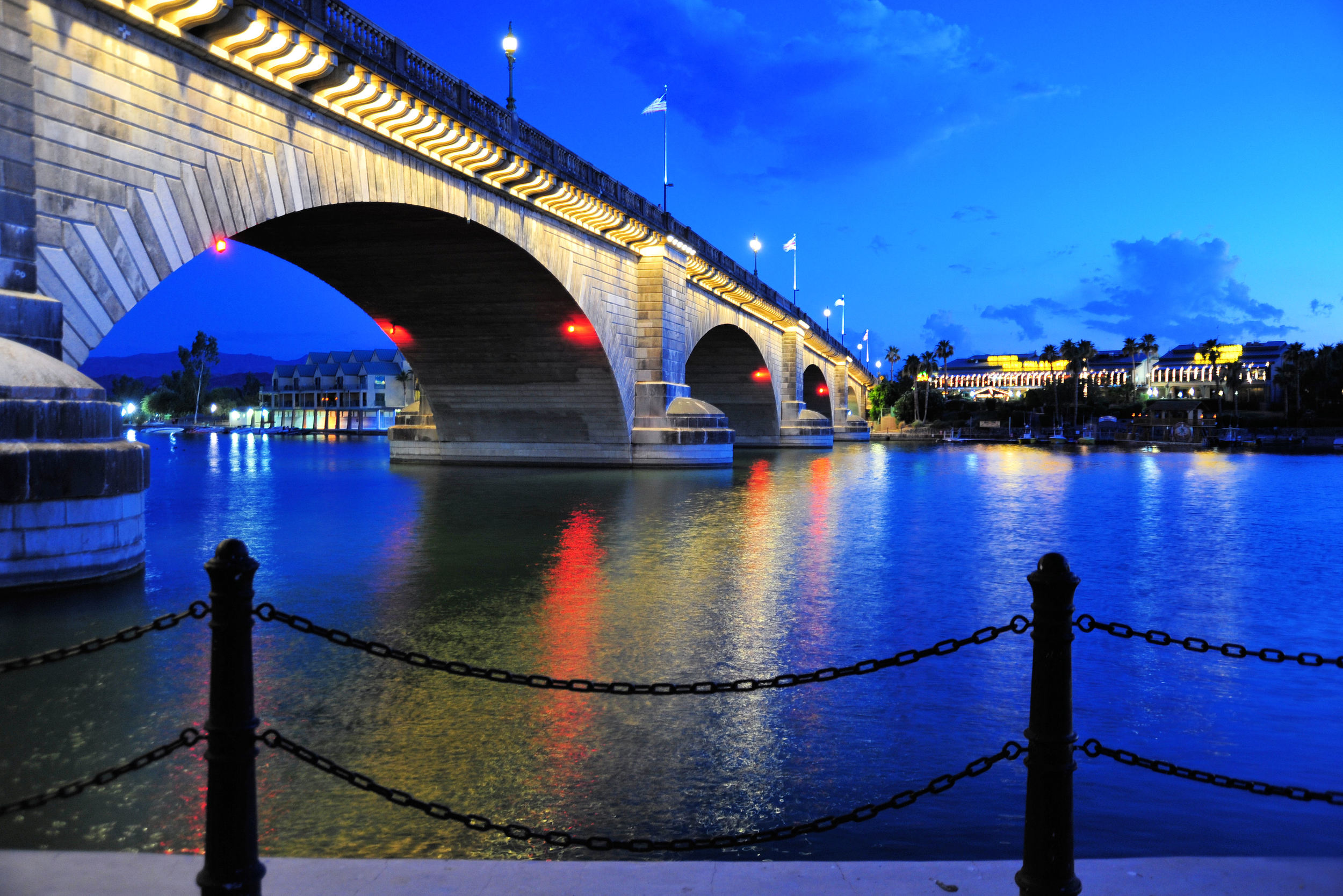
London Bridge was built across the Thames in about 1830, but by 1962 the old nursery rhyme was coming true and the bridge was no longer safe for traffic. The city of London decided to sell it, and along came a real estate developer named Robert P. McCulloch, who was having difficulty attracting people to his planned retirement community in Lake Havasu City, Arizona. He bought the bridge and it was dismantled in 1967 and transported to Arizona in pieces, each numbered. The original stonework was put in place over a new concrete structure, so the “falling down” was no longer an issue. Interestingly, the bridge was built on dry land and then a canal was dredged out under it. There is a rumor that McCulloch thought he was buying the much more recognizable Tower Bridge, but he and the sellers both have denied that. In any case, the plan worked and Lake Havasu City is now a thriving little desert town and recreation area.

For the shot I wanted to catch the lights and reflections, but I also wanted to be able to see the bridge, so I shot while there was still some ambient light. I used a Nikon D700 with a 24-120mm lens at 28mm and F/3.8. The ISO was 800, and I did a 1-second exposure. I didn’t like the result, though. It looked unbalanced and lacked depth, so I stepped back and included the posts and chains in the foreground.

Film Versus Digital

Film Versus Digital (Part 1)

Let me say up front that I was amongst the last to give up film and make the quantum leap to digital. In fact, I was practically dragged kicking and screaming in protest into the digital age of photography. Quitting smoking may have been easier. But I have never looked back in either case.

For years I was one of those film purists claiming stubbornly that digital could not match film for resolution and quality. That is no longer true, in either case. There are digital cameras now that far exceed film resolution and image quality. Next to a crisp, quality, digital image, film now looks a little blurred, muddled, and out of focus.

There are those who claim that film is better for learning the intricacies of photography because it forces you to thoroughly think things through before snapping the shutter. That is not true and probably never was. Digital provides instant feedback and gratification. You can look at the image immediately, see what you did wrong, and then fix it. What could be better for learning than that?

Quality film, if you can find it anymore, has increased dramatically in price. Kodachrome and Ektachrome are no longer in production and haven’t been for seven years. In fact, there is a great YouTube video about National Geographic's legendary photographer, Steve McCurry, shooting the last roll of Kodachrome back in 2009. Interestingly, he took a digital camera along to get the lighting and composition right before snapping any one of his thirty-six shots on that last roll. See the video here. https://www.youtube.com/watch?v=DUL6MBVKVLI

(to be continued)

Film Versus Digital (Part 2)

You can still find Fujichrome, but it runs about $52 for a 5-pack, and that doesn’t include the cost of processing, if you can even find a lab that will do it. And most likely, that lab will not be local, so also toss in the cost of shipping the film to them, and them shipping the transparencies back to you. There are labs that will happily convert your transparencies to digital files and email them to you, but doesn’t that sort of violate the idea of shooting film in the first place? Why not just shoot digital to start with and skip the film cost, shipping cost, processing cost, and time delay.

There are certainly things that can go wrong with digital memory, but I have never had such a problem (knocking on head—ouch, damn!) with digital. With film, though, the nightmares are many. Imagine shooting a wedding in film and sending it off to the lab—all the while praying that it comes out and that nothing went wrong, because you’re pretty sure the bride will burn you at the stake if it does. Imagine the prints coming back and everyone’s face is green, because you forgot that the reception hall was lit by fluorescent lights. You’d have to move to a new state under an assumed name. I have had film slip off the winding sprocket, resulting in thirty-six exposures on the same little rectangle of film. I have had film tear in half in an overly tight film can. I have had film fail to rewind because the little piece of tape holding it to the little axle in the film can came off. There’s nothing like the fun of opening the back of the camera to pull out that little can of film and having an entire roll of loose, exposed film fall out. On more than one occasion, I have had a lab process a roll of slide film as print film and totally destroy it. They did give me a free roll of film in compensation, but they balked at paying my expenses for another weekend trip to San Carlos, Mexico.

Nature photographers who like continuous firing of shutters to capture that perfect moment of a rapidly charging, hoof-pounding, dust-snorting rhino would burn through a roll of film in seconds, and then have to reload. With digital, that’s no longer an issue. You can get the shot and then immediately run for your life. Yes, digital photography can even save your life.

And it can get very expensive very fast to experiment with film. With digital, one can not only experiment freely, one can get instant feedback on whether it worked or not, and that can be important to whomever “one” is.

(to be continued)

Film Versus Digital (Part 3)

Imagine the bulk of film to be carried on a long trip. I spent five weeks on the Arctic Circle in Sweden one winter and took forty-three rolls of film with me. I had to go through many airports in both directions, and, every time I did, I dreaded what the x-ray machines might be doing to my film. I had it all in a lead-lined x-ray bag, but European airports didn’t like that and made me take it out. I rolled my own film, so the little canisters were a sinister looking black can with a knob on top. In London Heathrow coming back, they rudely dumped it all out on a table and three of the film cans fell on the floor. I was hoping the little end caps stayed in place. The guy then wanted to open all of the film cans to make sure there was film inside but finally relented when I almost had a stroke on the spot.

The last straw for me was the fact that there was nowhere to process transparencies on the Arctic Circle, so five weeks-worth of exposed film came all the way back to the states with me, and then I had to wait an additional three weeks while it was all processed, which cost a whole wad of money. Finally, I was able to look at my shots and there were many that I loved. There were others, though, that I looked at and thought, “Wow, that would be a great shot, if I had just done ____.” Had I known the shot didn’t work at the time, I could have done something about it.

With digital, I can carry a crap-load of memory in a nice little plastic box the size of a cell phone, easily sufficient memory for a five-week excursion. And I can walk through airport security whistling Dixie while they scan my camera bag, although I seldom actually whistle Dixie while they scan my bag, partly because I really don’t whistle all that well, and partly because it’s not really PC and might result in a body cavity search.

Another advantage to digital is that I can use the same Compact Flash or SD-card over and over. It has no expiration date, and I don’t have to keep it in the refrigerator to make it last longer. This leaves more room for more important stuff in there—like beer.

I read the other day that the Nikon D5 can be pushed up to an ISO of over 3,000,000. Good luck finding a film that would be able to do that. And if you did, it would be so grainy that you wouldn’t be able to blow it up bigger than an inch to a side. Early in the digital age, noise was an issue at high ISOs. That is no longer the case with higher-quality digital cameras. And if there is any noise, it can be easily removed in post-processing.

Speaking of that, I think the biggest advantage of all to the digital world of photography is the capability to edit in post-processing. It is now possible to make an image truly reflect reality, and sometimes it is even possible to improve upon it. Certainly, some small degree of editing could be done in the darkroom in film days, but if you didn’t have a darkroom, you couldn’t even do that.

To those last few die-hards still holding onto your film, give it up. Digital photography is a beautiful thing and you will never regret the switch. Technology is your friend.

For more, see my website at www.dubscrogginphotography.com


Photo Editing In A Digital World

The biggest difference between someone shooting snapshots with a camera on their phone, and a professional photographer is not the equipment, although that it is also a pretty big difference. Modern smart phones can take some pretty impressive pictures, no question about it. No, the biggest difference is photo editing. The average tourist shooting a camera phone snapshot of the kids mugging Goofy at Disneyworld is not going to do anything with that picture except maybe show it off to friends and family on Facebook, and nowadays it will probably live on the phone forever. He or she is probably not going to edit it to make it better.

A professional photographer, however, is usually shooting in camera RAW mode. When you look at a RAW file straight-out-of-camera (SOOC), it's really not very impressive. It looks flat and lifeless. But hiding in that file is a tremendous amount of data, and that data can be used to do amazing things to help the picture capture reality, and sometimes even improve upon it. SOOC my RAW files are on the order of 75MB each. A camera phone picture might be 5-6MB, although some do go higher. And I can convert my RAW file to something you could print the size of a wall without it looking bad up close. The detail is amazing, and it is one of the main reasons I bought the camera I have. I definitely can't order a pizza or check my email on it, though, so it does have its limitations.

There are self-styled photographic "purists" who condemn photo editing and yearn for the old days of film, when what you shot was what you got, assuming you had the talent and equipment to get it. These people are stuck in another age and not equipped to handle the modern one. Technology has made huge leaps forward in photography and it has truly revived a dying art. Embrace it. Technology is your friend.

There are also those who claim that photo editing is dishonest and doesn't reflect reality. Hogwash. One of the greatest photographers this country has produced, Ansel Adams, was very talented at capturing perfect light at perfect moments. But he was far more talented in the dark room, than behind the camera. Photo editing wasn't much in his days, but he pushed what he had to the edge of its capability and advanced the photographic art by doing so. Imagine the things he could have done with a modern digital camera and Photoshop. I'm sure he would have pushed both to the edge of their capability.

There are others who dismiss any pictures that look better than their pictures with the statement, "Must be Photoshopped." In fact, "Photoshopped" has become an easily understood word in our society, and it is usually not used in a complimentary fashion. For example, I have heard someone make this statement, "That's a really great picture. It must have been Photoshopped." It is insulting and it is meant to be. And it often comes from a thinly veiled envy.

Thanks to technology and computers, the art of photography has evolved, and it has done so for the better. Now great photography entails both talent with a camera, and talent with a computer. Those who are best at the latter do so in a way that enhances the former without being overtly obvious about it. Certainly, there are those who push the computer aspect beyond credibility, and at some point the work becomes more digital art than photography, but it is still art.