Back in the olden days when film ruled the world of photography, you basically got what you shot. It was possible to make post-shot changes in the darkroom but only limited changes were possible. Cropping, dodging, burning, and exposure were about the only things one could change. Imagine if masters like Ansel Adams had digital cameras, computers, and the capabilities of Lightroom and Photoshop with which to play. They took darkroom editing to its limits, but that capability pales in comparison to the post-processing and editing we can do today. Which brings me to my purpose with this blog, the evolution of an image from what I originally shot to what I finally ended up with.
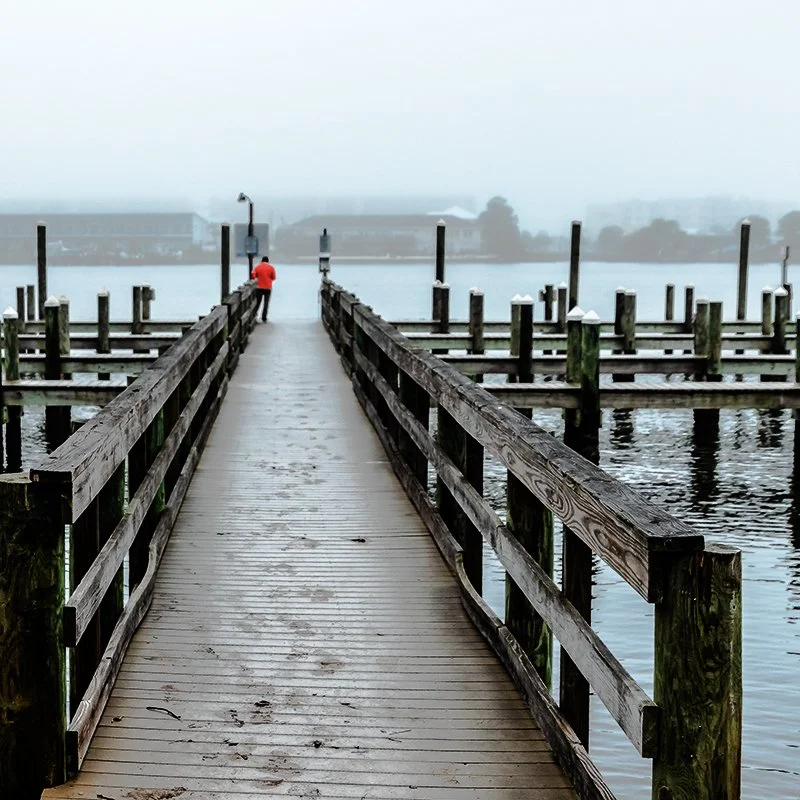
This is the original image, shot on a dreary, foggy, winter morning in Florida. It was taken with my Nikon D810 at f4, 1/200 sec, ISO-200 with a 28-105mm zoom lens set at 28mm. My original intent was to capture the entire dock, which I did. I noticed the solitary person standing out there, but he was small, blended into the gray and not my subject.
As I was looking at the image, I decided I would prefer a tighter crop to accentuate the lines at the center and the person standing there. At the same time, I adjusted the crop to move that person to the upper left intersection of the “rule of thirds” lines, putting him a third over and a third down from the top left corner. I also needed to straighten the horizon. The image changed to this.
I liked that a lot better. The subject was now the person, not the whole dock, and the lines served to highlight that subject. I decided I needed to do more there, though, so I used an overlaid layer to change his coat to red and then used the transparency slider to adjust the intensity of the red..
I liked the red coat much better. It brought the focus more onto the guy standing out there. I wasn’t completely happy with the crop though. I didn’t like the concrete in the foreground or all the white space at the top and felt neither contributed to the image. I needed to crop at the top and bottom, but I didn’t want to lose the lines at the sides. So I made a second crop but went with a square format, trimming top and bottom but not the sides. With the square format, I was also still able to keep the subject at the “thirds” intersection.
But then I thought as long as everything in the image is monochrome except the red coat, I might as well convert the whole image to black and white to enhance the texture of the shot. So I did. Then I used the history brush to erase the black and white conversion from the coat. This is the final image.
There are hundreds of things I could have done to this image becauseI have the post-processing tools to do so. Basically, this means there are minimal limits on my creativity. Thanks to the digital age of photography, I can visualize what I want the image to look like and then make it happen. Of course, it is important to do as much to capture my vision as possible with a clean, in-focus, correctly exposed and composed image in-camera, but I have the option to make an image stronger and, in some cases, even rescue an image I might otherwise just delete. For example, this shot was also taken on a foggy Florida morning.
I very nearly deleted it as having no redeeming qualities. But then I decided I still liked the footprints in the sand that led me to take the image in the first place, and that maybe there was something I could do in Photoshop to rescue the shot. I ended up with this, which I like a lot.


